CMURC (Central Michigan University Research Center)
Brand Identity
Illustration & Infographics
Marketing Materials
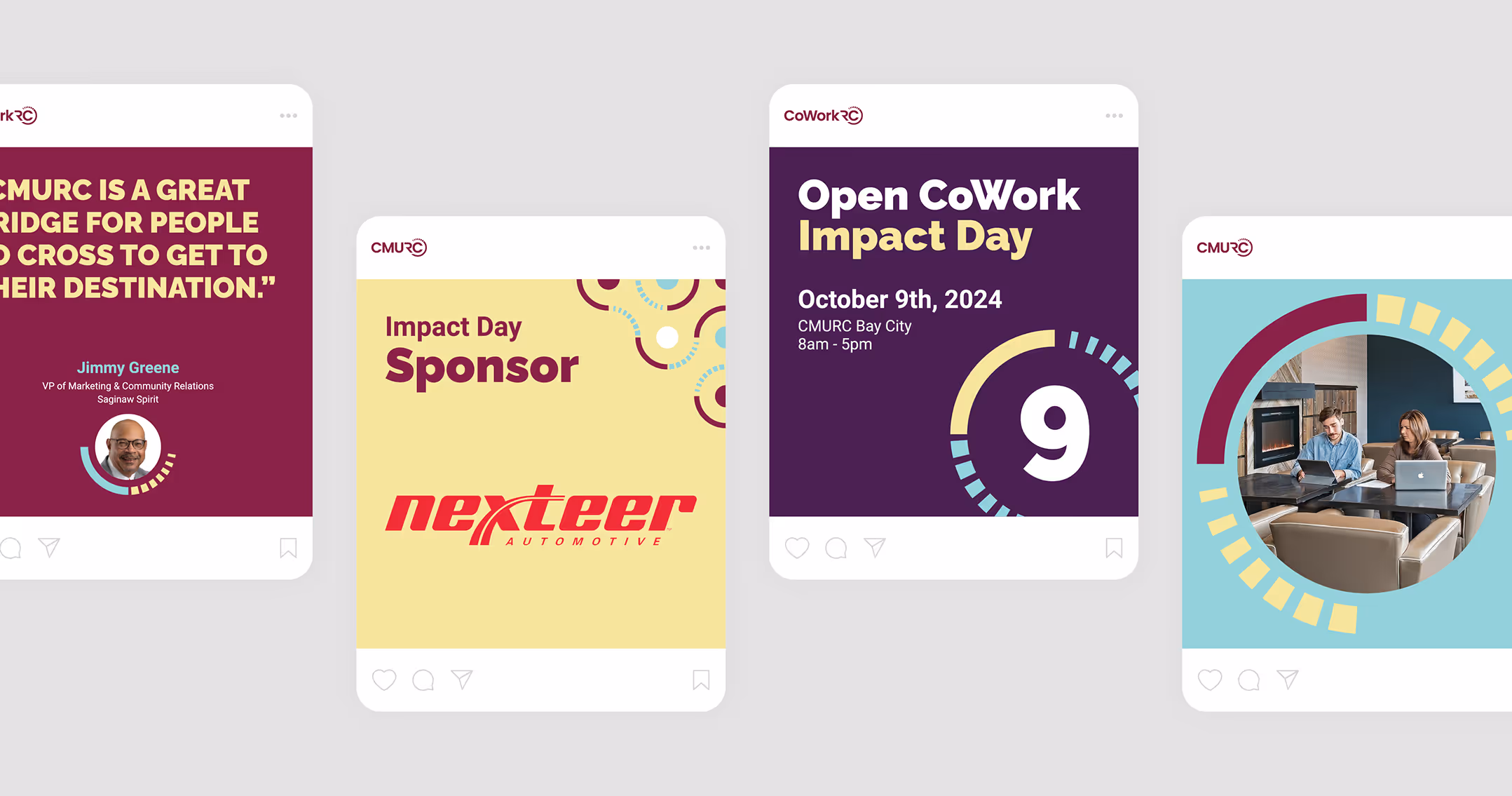
Social Media
Identity Refresh
Sub-Brand Logos
Print
Presentation
Illustration & Infographics
Brand Guidelines
Since 2011, CMURC has supported entrepreneurs in the Michigan Great Lakes Bay Region by offering coworking spaces and accelerator programs that drive innovation and economic growth. Through strong partnerships, they bridge the opportunity gap and provide vital business resources to individuals from diverse backgrounds. However, as CMURC expanded, their existing branding no longer captured the organization’s energy and forward-thinking mission, prompting a comprehensive rebrand.

Core principles

Logo refresh
Color combinations
Clear space
Sizing
Promotional gear - T-shirt


Brand architecture

Promotional gear - coffee mug

The new visual identity embraces a vibrant color palette, blending warm yellow and cyan tones with the original maroon to honor CMURC’s roots, while deep violet adds bold contrast. A primary typeface is modern and balances precision with friendly feel, and a heavier display font reinforces the organization’s confident, progressive approach. A key graphical element, the "hub," derived from the CMURC logo, serves as the foundation for patterns that reflect the brand’s core values.
Color palette

Typography

Typography hierarchy & alignment

Business cards

Tri-color icon set
Maroon mono-color icon set
Yellow mono-color icon set
Violet mono-color icon set
Blue mono-color icon set
Graphical element

Hub components

Hub component configuration

Posters

Graphical elements usage & color combinations


Promotional gear - tote bag

Brand guidelines

Presentation slides


Social media posts